
Finding business confidence in family roots
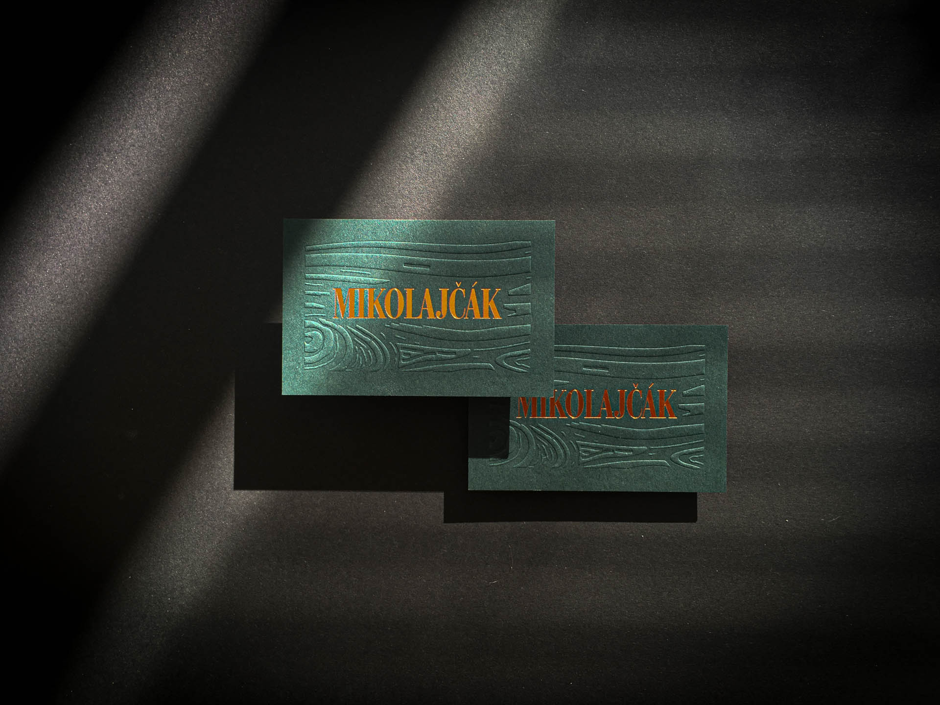
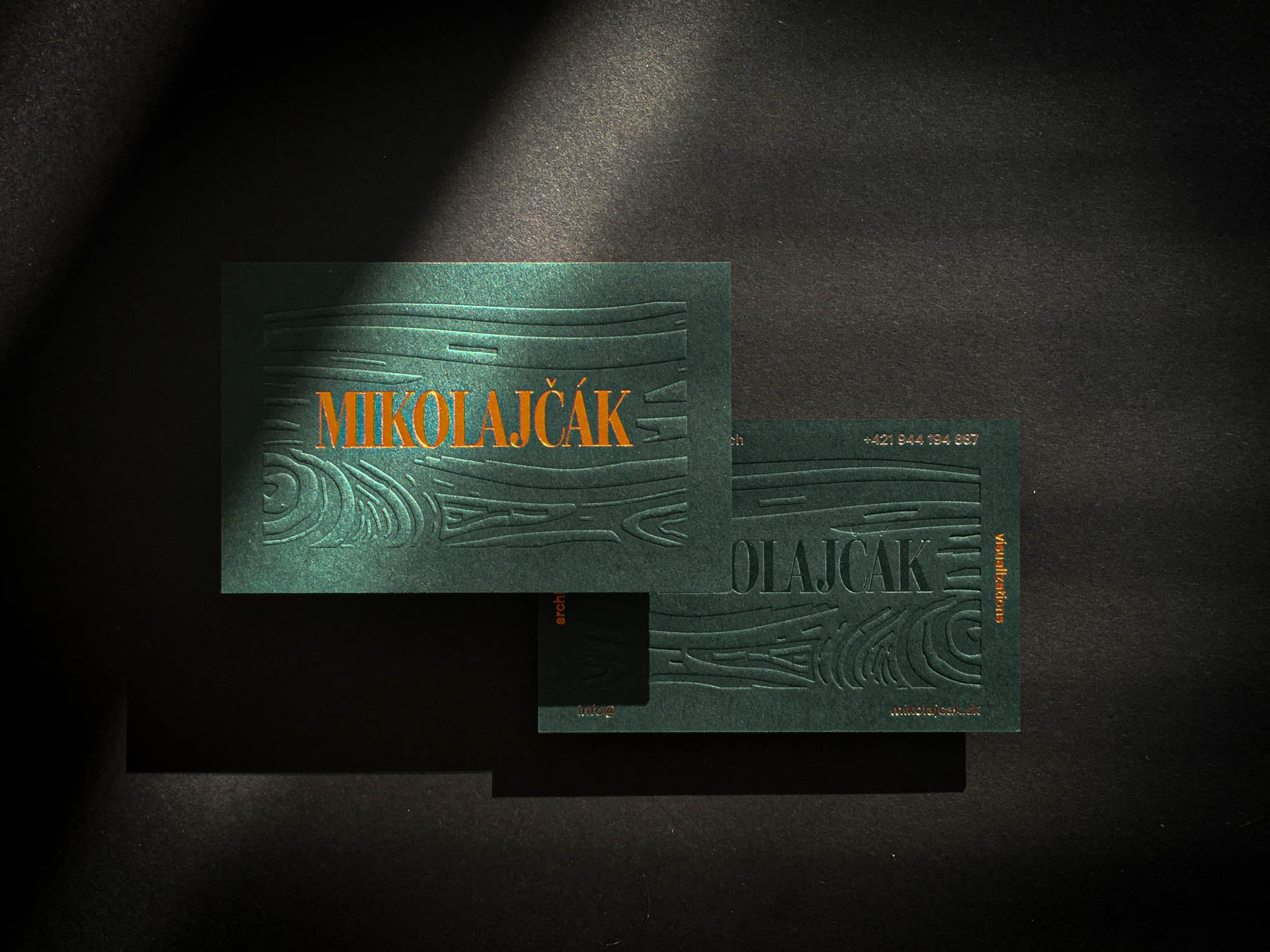
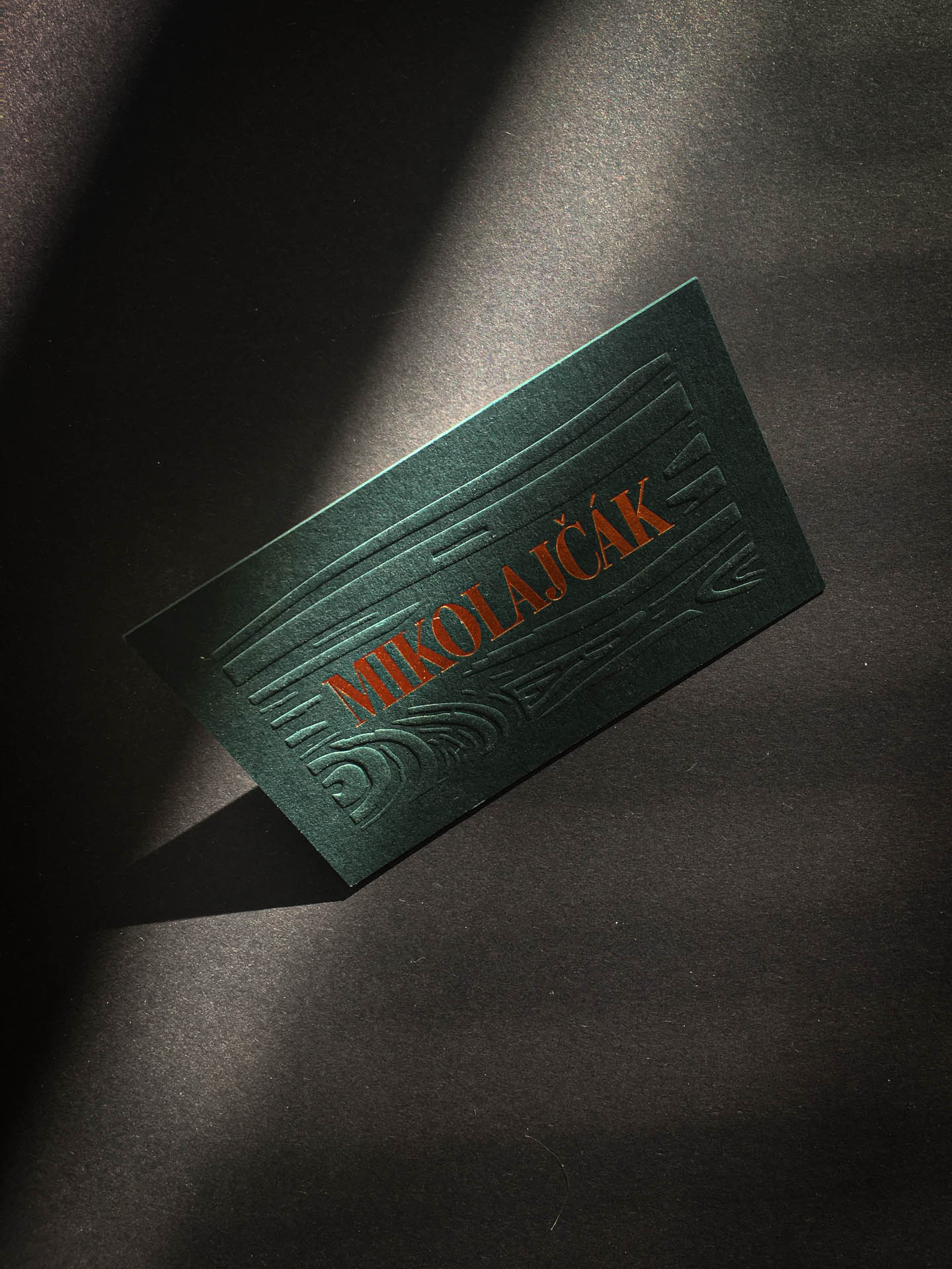
Daniel Mikolajčák is a 3D premium designer. Main task was to design elegant and classy logo with crafting high quality business cards that reflects his most favourite material – wood.
Project scope
Visual Identity
Collateral Design
Client: Mikolajčák
Printing: Prikler Print Atelier
Year: 2021
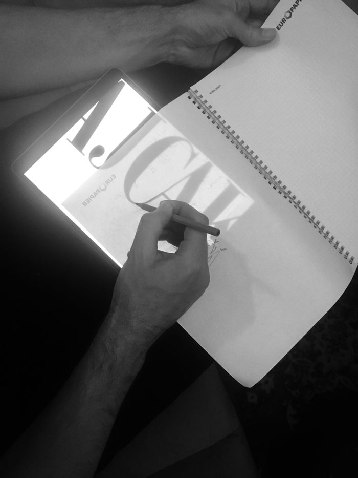
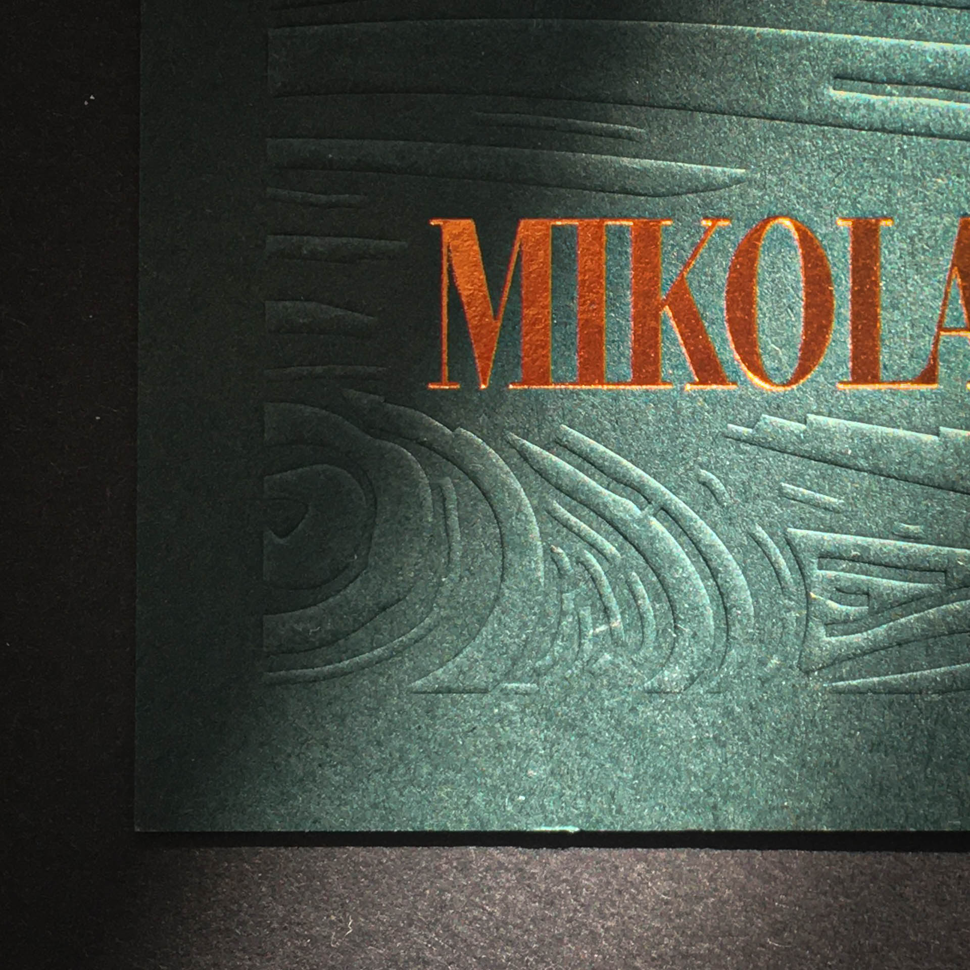
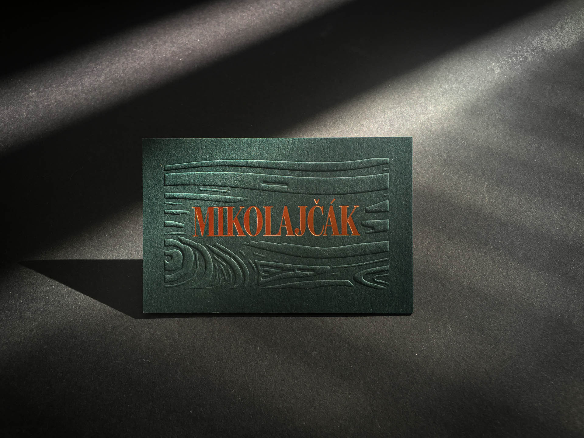
Logo brief was very straightforward – use only surname, no symbol. The priority was to achieve a premium and elegant look. After several sessions together, the result was clear. The choice fell on the condensed serif font Didonesque, in which a few custom adjustments were made to make the inscription more compact.
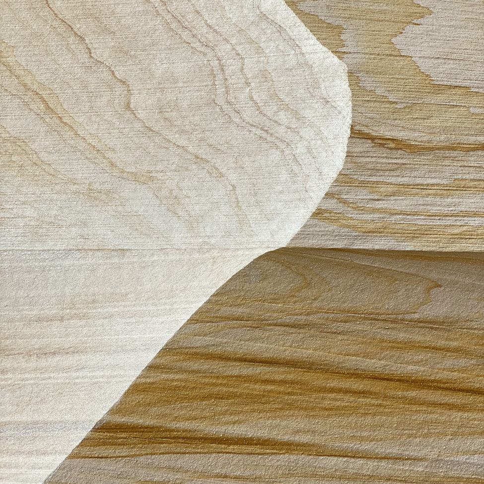
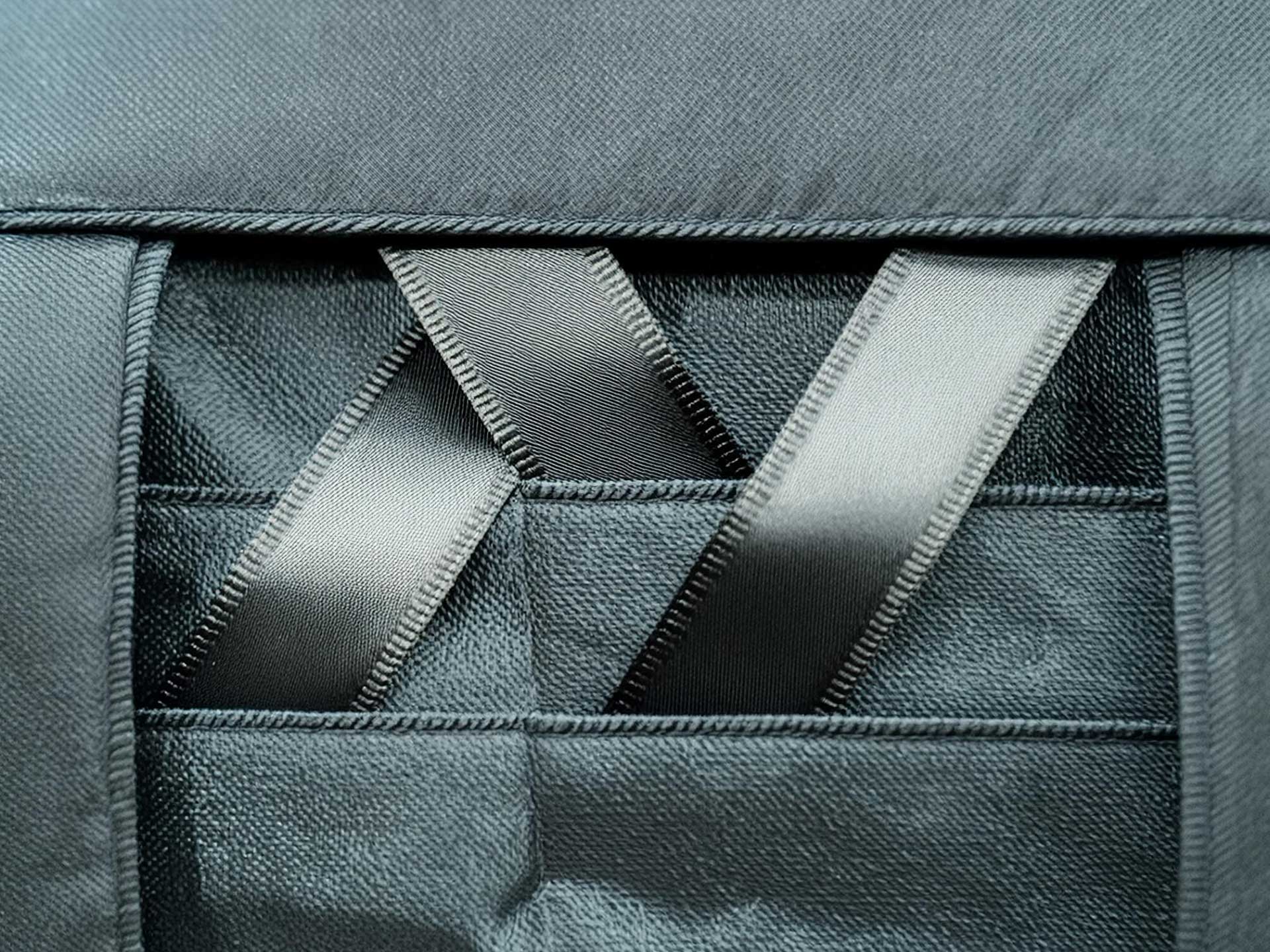
Daniel's work is fundamentally three-dimensional. It was clear from the beginning that his business card could not be just a standard 2D affair. Daniel's most favourite material is wood. We chose embossing of a wooden relief on paper. Mr. Richard Prikler from Prikler Print Atelier took care of the perfect printing job.
Related projects
movebase — Visual Identity (coming soon)Project type

K&L Rock — Visual Identity (coming soon)Project type
Ověř nápad za 30 dní — Book DesignProject type
NADA — Visual IdentityProject type
Inspire Design Visual IdentityProject type
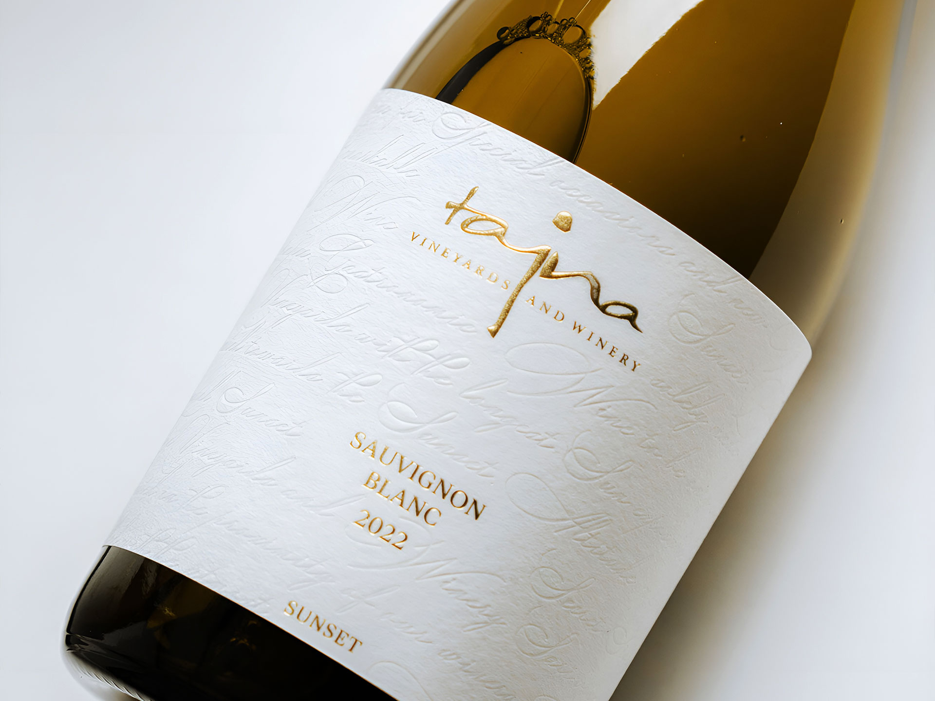
Tajna — Sunset labelsProject type
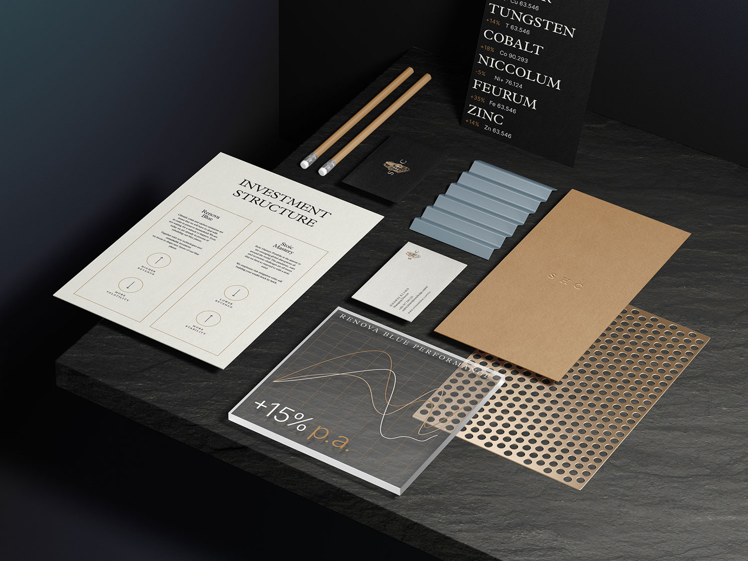
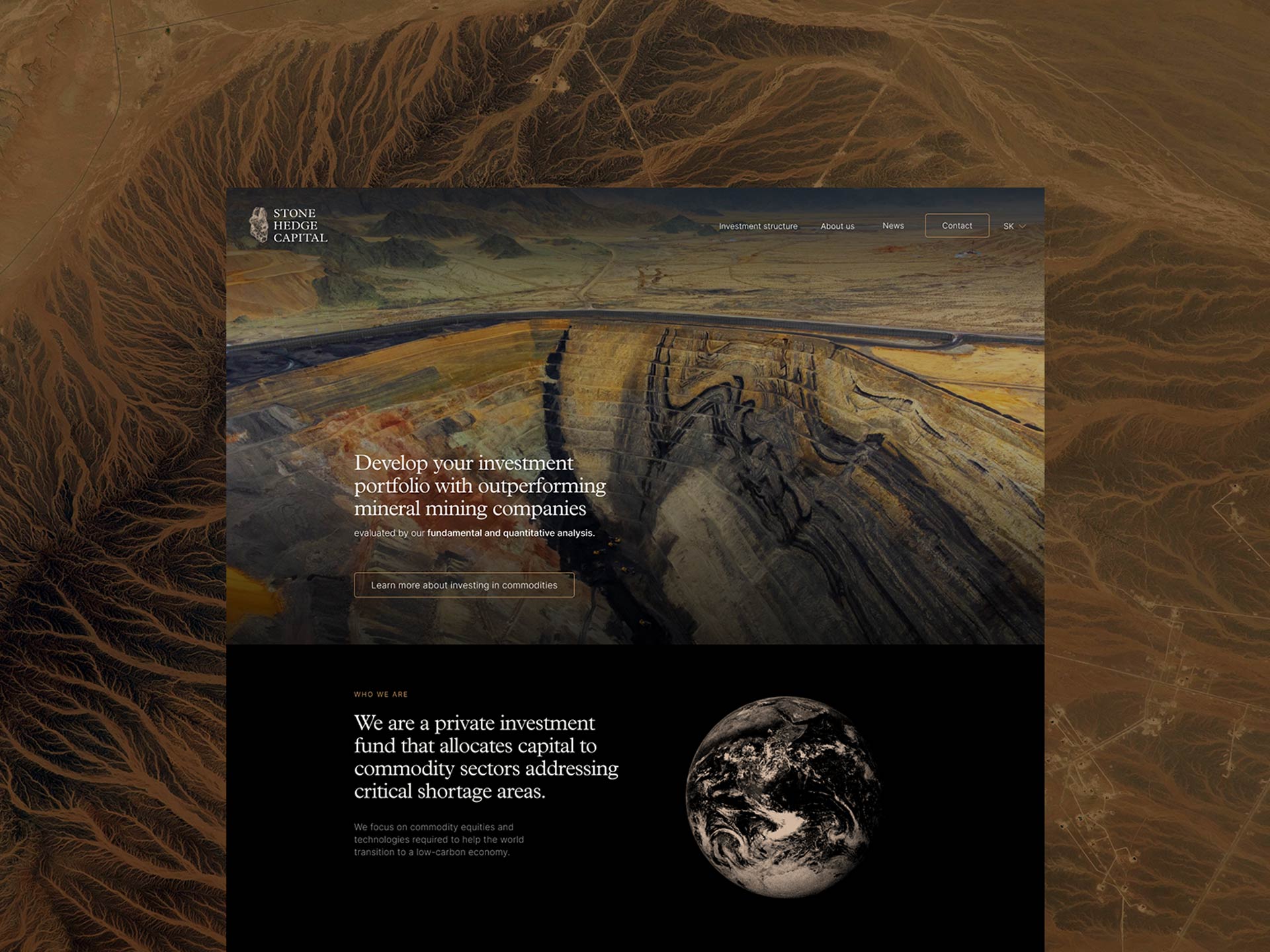
Stone Hedge Capital — Visual IdentityVisual Identity
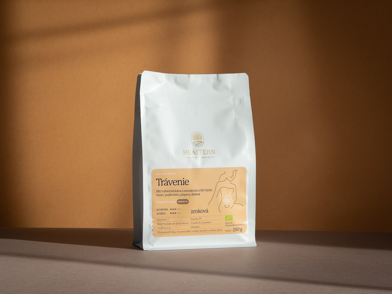
Healtern — Identity & Packaging DesignVisual Identity
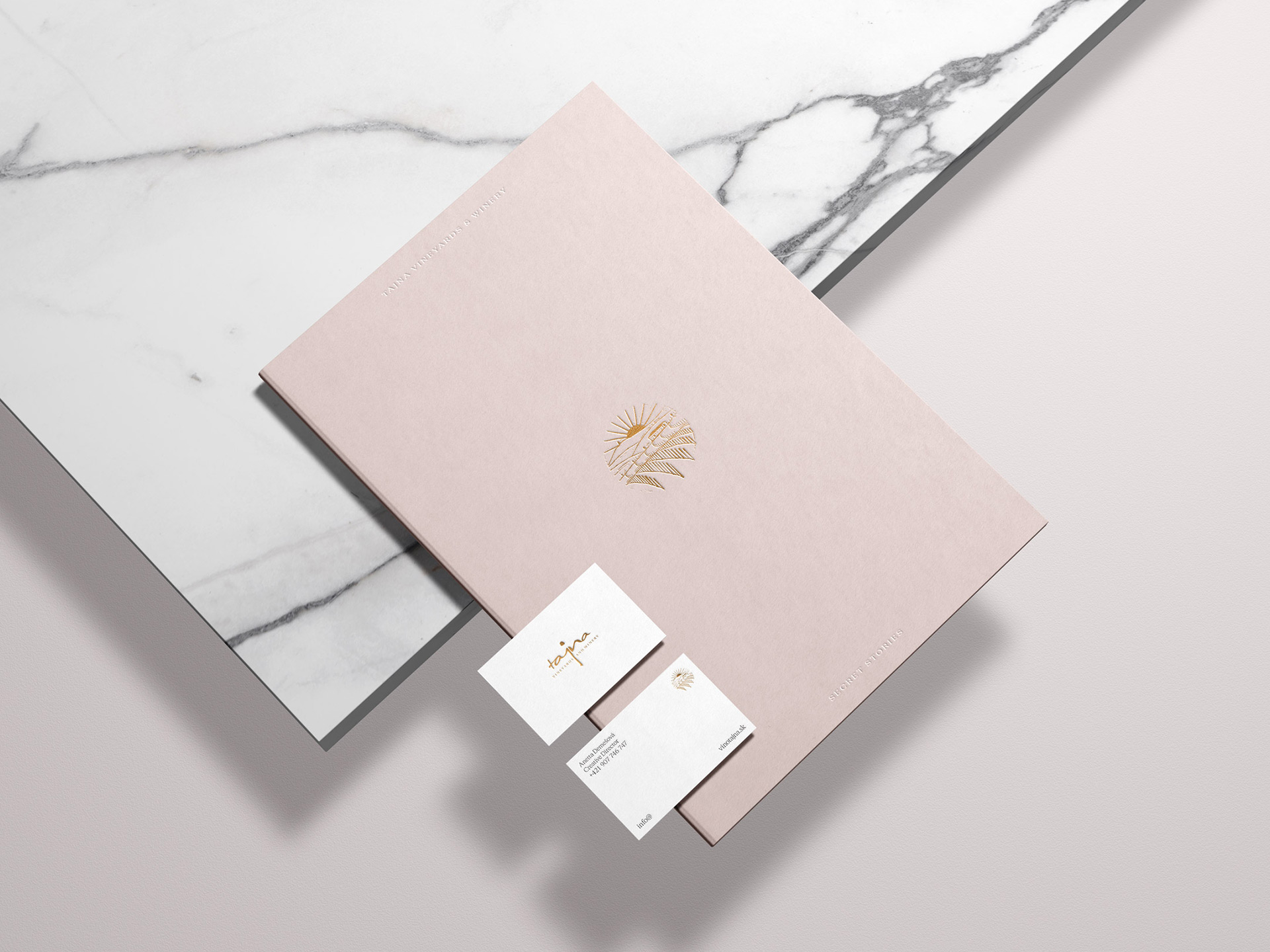
Tajna Vineyards & Winery — Visual IdentityVisual identity
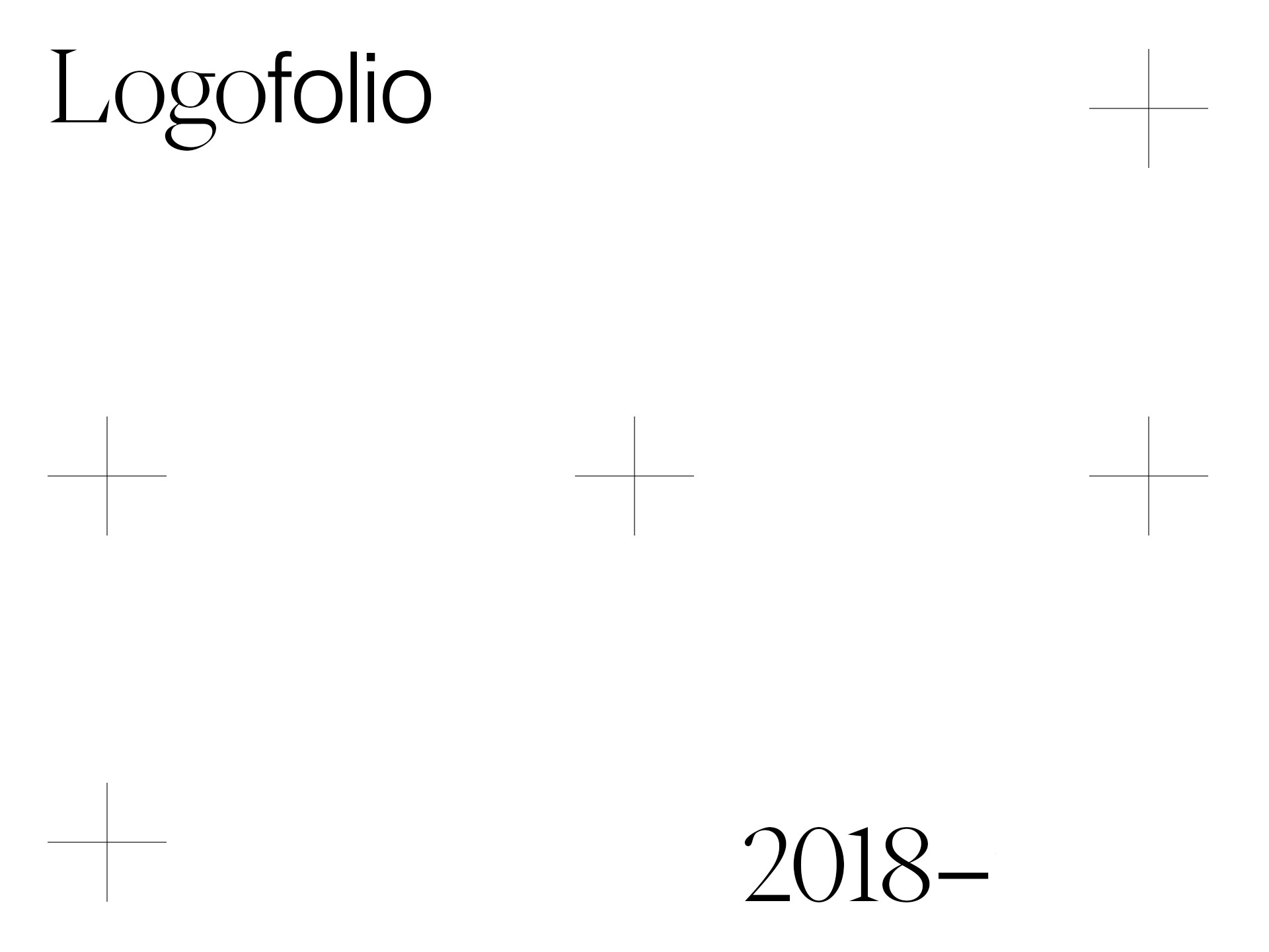
Logofolio 2018 –Logo design
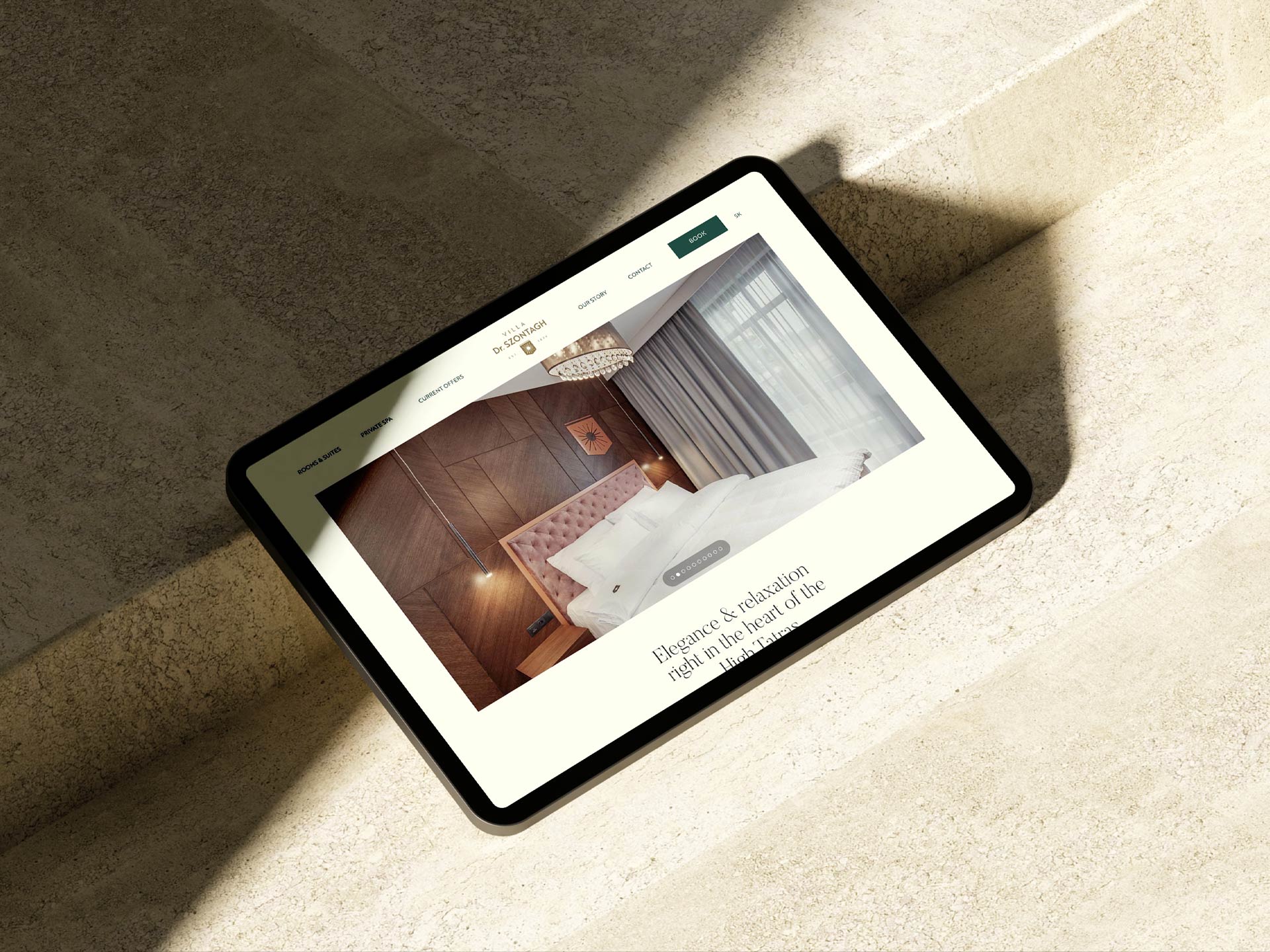
Villa Dr. Szontagh — Visual IdentityVisual identity

Cafézia — Packaging & Visual IdentityVisual Identity